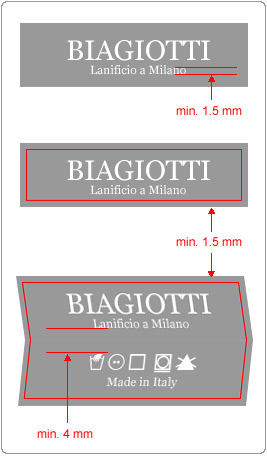
Important! keep the distances and the min. size of letterings!

The golden rule: print it out first!
If all elements of the label artwork are well legible on a printout at the real label size, they will also be legible on the woven or printed fabric label. A normal ink-jet print will be pretty similar to the woven or printed result.
More rules
- Letterings should have a minimum height of 1.5 mm (measure the lower case letters).
- For woven labels, avoid a narrow charcacter spacing of small letterings.
- Letterings that are made of handwriting or italic style fonts should have a minimum height of 2 mm (measure the lower case letters).
- The distance of graphic elements to the label borders should be at least 1.5 mm. In case of a thermo- or self-adhesive backing or a laser cutting, the distance must be at least 3, rather 4 mm.
- Gradients, shadows and other element that consist of continous tones are not producible using single colour yarns.
A tip: Remember good design principles
For a woven label the same design principles apply as for any other artwork or logo. A good design is simple and reduced to what shall be noticed, it uses max. 2 font types and it leaves enough space around graphic elements for them to take effect.